# CSS Flexbox
- The Flexbox Layout (Flexible Box) module
- [W3C Candidate Recommendation as of October 2017](https://www.w3.org/TR/css-flexbox/)
## Basic Term
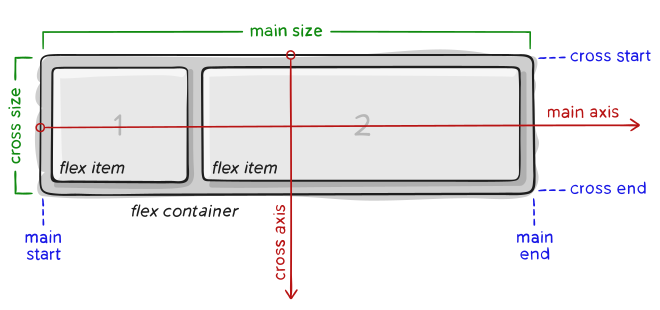 ## Basic Concept
- Container
## Basic Concept
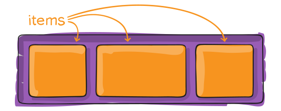
- Container
 - Item
 ## CSS for container
```css
.container {
display: flex; /* or inline-flex */
}
.container {
flex-direction: row | row-reverse | column | column-reverse;
}
.container {
flex-wrap: nowrap | wrap | wrap-reverse;
}
.container {
flex-flow: <‘flex-direction’> || <‘flex-wrap’>
}
.container {
justify-content: flex-start | flex-end | center | space-between | space-around | space-evenly;
}
.container {
align-items: stretch | flex-start | flex-end | center | baseline;
}
.container {
align-content: flex-start | flex-end | center | space-between | space-around | stretch;
}
```
## CSS for items
```css
.item {
order: ; /* default is 0 */
}
.item {
flex-grow: ; /* default 0 */
}
.item {
flex-shrink: ; /* default 1 */
}
.item {
flex-basis: | auto; /* default auto */
}
.item {
flex: none | [ <'flex-grow'> <'flex-shrink'>? || <'flex-basis'> ]
}
.item {
align-self: auto | flex-start | flex-end | center | baseline | stretch;
}
```
## ref
- https://css-tricks.com/snippets/css/a-guide-to-flexbox/
## CSS for container
```css
.container {
display: flex; /* or inline-flex */
}
.container {
flex-direction: row | row-reverse | column | column-reverse;
}
.container {
flex-wrap: nowrap | wrap | wrap-reverse;
}
.container {
flex-flow: <‘flex-direction’> || <‘flex-wrap’>
}
.container {
justify-content: flex-start | flex-end | center | space-between | space-around | space-evenly;
}
.container {
align-items: stretch | flex-start | flex-end | center | baseline;
}
.container {
align-content: flex-start | flex-end | center | space-between | space-around | stretch;
}
```
## CSS for items
```css
.item {
order: ; /* default is 0 */
}
.item {
flex-grow: ; /* default 0 */
}
.item {
flex-shrink: ; /* default 1 */
}
.item {
flex-basis: | auto; /* default auto */
}
.item {
flex: none | [ <'flex-grow'> <'flex-shrink'>? || <'flex-basis'> ]
}
.item {
align-self: auto | flex-start | flex-end | center | baseline | stretch;
}
```
## ref
- https://css-tricks.com/snippets/css/a-guide-to-flexbox/